
Transforming a legacy app with modern, user-centered navigation to supercharge usability
Business impact
This redesign delivered a faster, more seamless user experience while driving the shift to a self-service model.
By dramatically reducing dependency on support teams and boosting operational efficiency, it paves the way for significant long-term savings and scalable business growth.
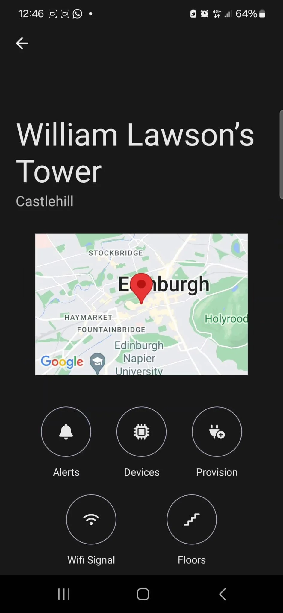
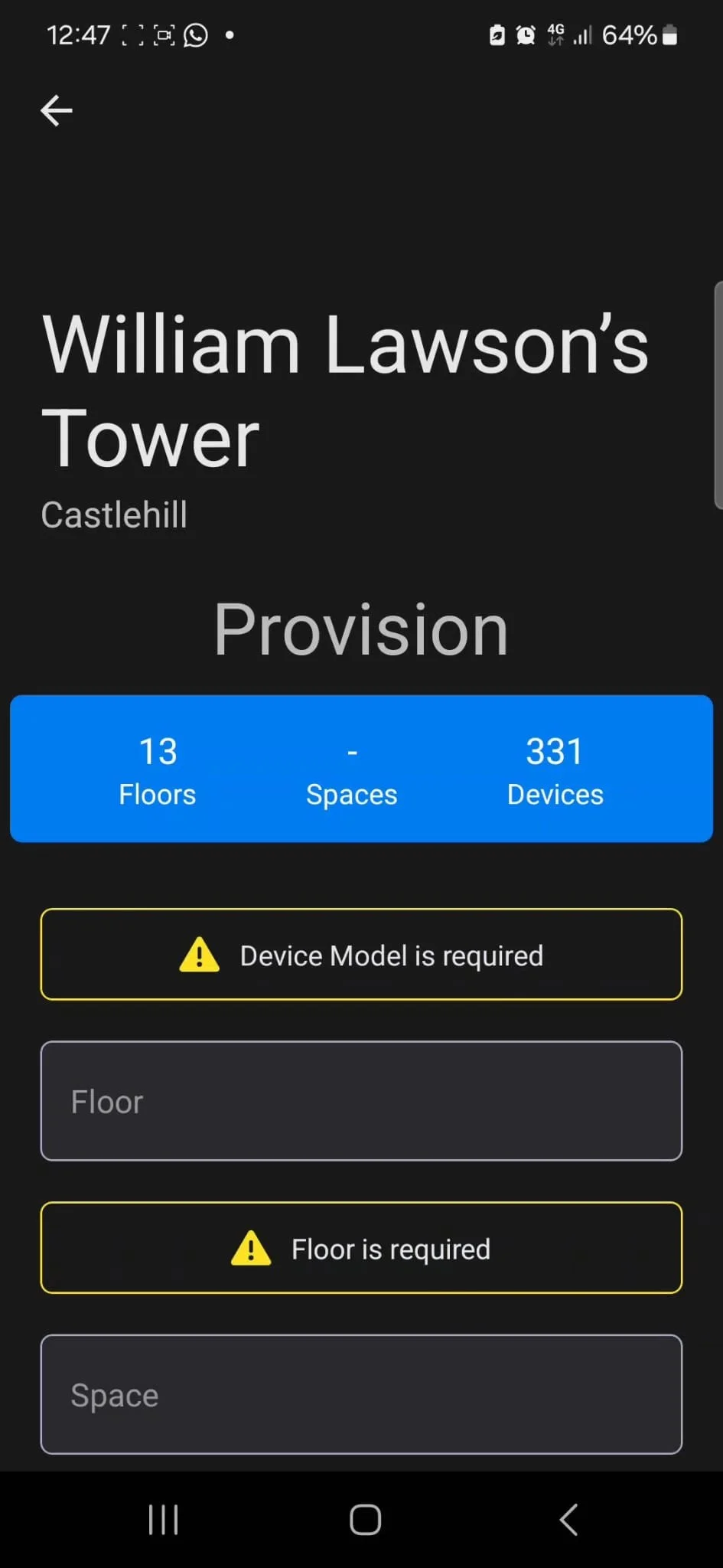
Before
After
User Persona
Persona
The Installer sets up key hardware devices: smart heating (self-regulating panels, TRVs), utility meters (electricity, water), and environmental sensors (multi-sensors). Their work supports sustainability, improves building maintenance, cuts costs, reduces environmental impact, and enhances resident well-being.
Need
More independence to handle day-to-day tasks on their own.
Pain point
Installers are limited to a few tasks in the app. They end up relying too much on the support team for everyday work.
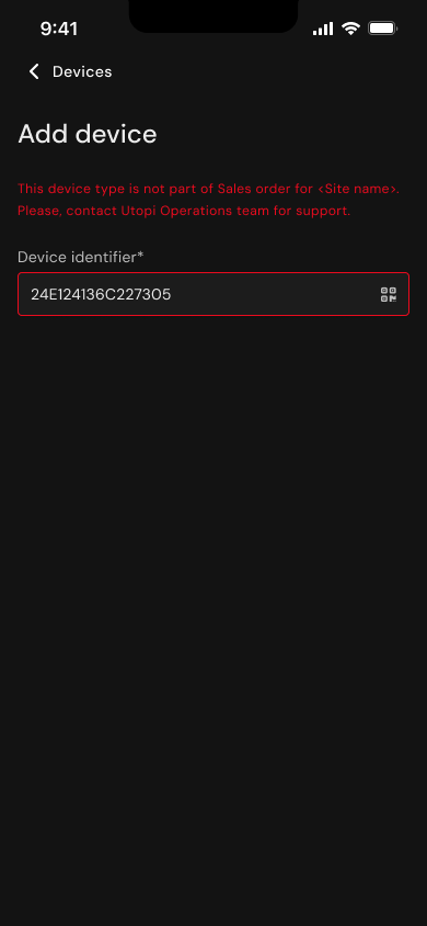
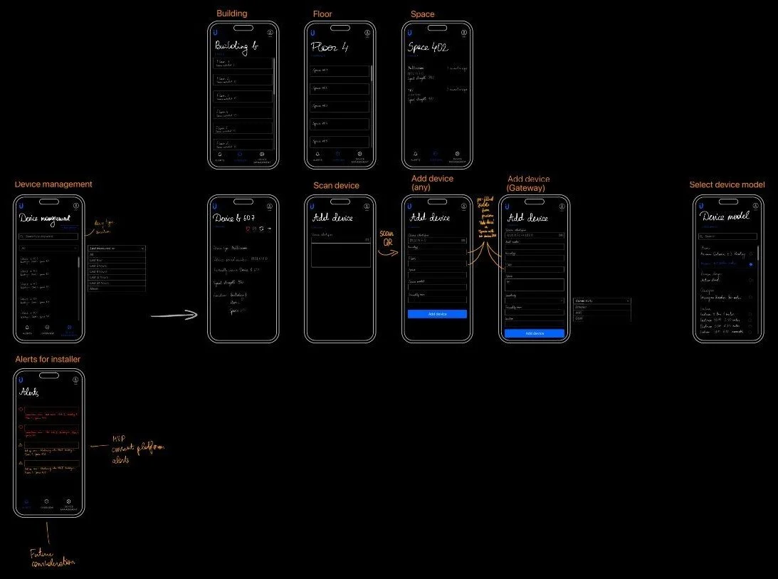
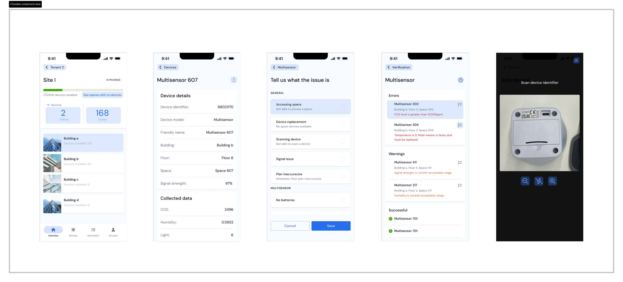
Key screens


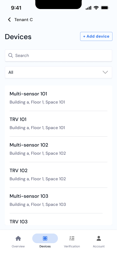

What does the app do?
🤳🏻 Scan QR to Add/Replace Devices
🦺 Relocate Misinstalled Devices
👀 Track Real-Time Installation Progress
🚧 Live Trouble Shoot
👷🏾 Fix Issues on the Spot
🚩 Flag Unresolved Issues
🗨️ Add Comments for Unidentified Issues
📋 Installer To-Do List
🗺️ Coordinate Precise Device Location
✍🏽 Sign Site Finalisation Documents (Sign-off)
Improvements
✔️ ENHANCED NAVIGATION
navigation from a singlar screen (adding to cognitive overload)
✔️ BETTER ERROR PREVENTION
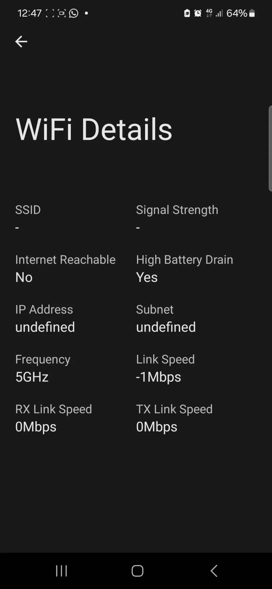
cluttered UI, inconsistent error display, fragmented experience
✔️ USER-CENTERED CONTENT
mixed different types of data creates confusion
✔️ INTUITIVE EXPERIENCE
lacking visual hierarchy, whitespace, inconsistent typography, Z reading pattern
real-time validation when device QR is scanned
tailored content is presented to mimic user’s behaviour, enhancing the relevance of information
content flows the way user would naturally process it
improved readibility
users can swiftly scan through
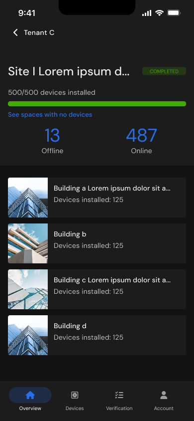
4-item bottom navigation across main screens


Initial wireframes
Research

Decision
Accessible button size
During quality assurance, a team member pointed out that the buttons appeared too small. Although they met accessibility standards, something did not feel quite right.
I took a step back to consider our target users—installers, a role predominantly filled by men in manual labor. With larger hands and thicker fingers, the small buttons were simply not practical.
After revisiting the design and adjusting the button size, the feedback was overwhelmingly positive. The buttons became more accessible and much more comfortable for users to interact with.
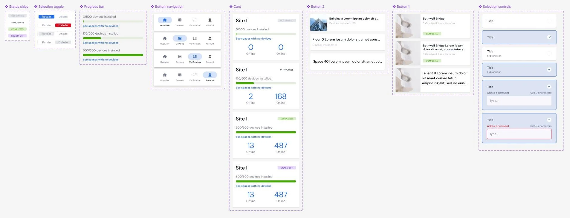
Figma components
Key takeaway
Accessibility standards are just a baseline. Design for your users, not just the rules.
Sitemap from heuristic evaluation

Before
Inconsistent visual hierarchy, input field sizing, layout, and low color contrast create a cluttered UI that is difficult to scan, hindering both usability and accessibility, and making navigation unnecessarily challenging.
After

A unified design with consistent component usage.

User impact
The revamped ‘Support App’ transforms the installation process, giving installers real-time tracking across multiple sites, instant troubleshooting, and effortless device management—all at their fingertips. With intuitive bottom navigation and a sleek, unified design, the app streamlines workflows, enabling installers to work faster, smarter, and more independently than ever before.